
Survival analysis
Contents
4. Survival analysis#
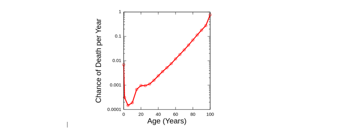
Aging - increased chance of death with age.
You have seen this picture previously
At this lesson, we will study survival analysis, learn how to understand mortality risk and survival curves. We will talk about Gompertz model - the seminal concept in aging research as well as learn how to analyze real survival data, fit survival models, compare survival curves, and make conclusions about survival experiment.
Survival analysis is a set of statistical methods for data analysis where the outcome variable of interest is time until an event occurs. For instance, in biological and medical sciences commonly studied events are diseases, relapse, recovery and death. Survival analysis is especially important in clinical research, where it is widely used to estimate the probabilities of patients’ survival under different treatments taking into account various risk factors (covariates)
4.1. Main concepts#
4.1.1. CDF and PDF#
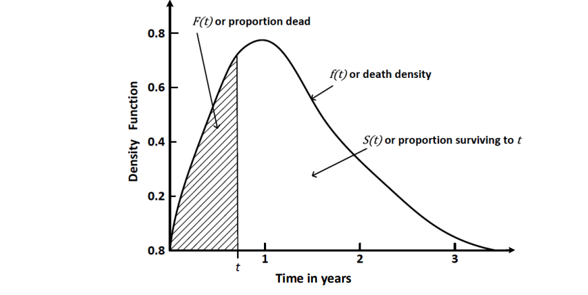
In probability theory and statistics, the cumulative distribution function (CDF) of a real-valued random variable X, or just distribution function of X, evaluated at x, is the probability that X will take a value less than or equal to x
Probability that random variable is between x1 and x2: $\(P(x1\leq x\leq x2) = F(x2) - F(x1) \)$
The probability density function (PDF) can be interpreted as providing a relative likelihood that a random variable X, will take a value exactly equal to x.It is equal to the derivative of CDF: $\(f(x) = \frac {dF(x)} {dx}\)$
Now lets find CDF and PDF in survival analysis. For that at first we will talk about the survival curve:
4.1.2. Survival curve#
Let \(T\) is a non-negative random variable with a corresponding distribution function:
We call \(T\) - survival time or time before death of some object (e.g. human). For example, \(T\) can have an exponential distribution:
import numpy as np
import pandas as pd
from scipy.stats import expon
import matplotlib.pyplot as plt
plt.rcParams['font.size'] = '16' # increase font size

rv = expon()
t = np.linspace(0, expon.ppf(0.99), 100)
fig, ax = plt.subplots(1, 1)
ax.set_xlabel('Time')
ax.set_ylabel('Probability to die')
ax.plot(t, rv.cdf(t));
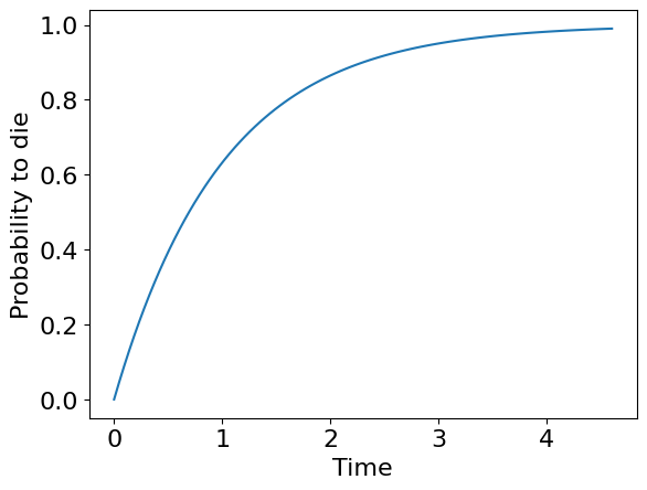
If \(F(t)\) is a probability to die before time moment \(T\) we can introduce a probability to survive before this moment \(S\) as just a complement to \(F\):
Let’s draw it:
rv = expon()
t = np.linspace(0, expon.ppf(0.99), 100)
fig, ax = plt.subplots(1, 1)
ax.set_xlabel('Time')
ax.set_ylabel('Probability to survive')
ax.plot(t, 1 - rv.cdf(t));
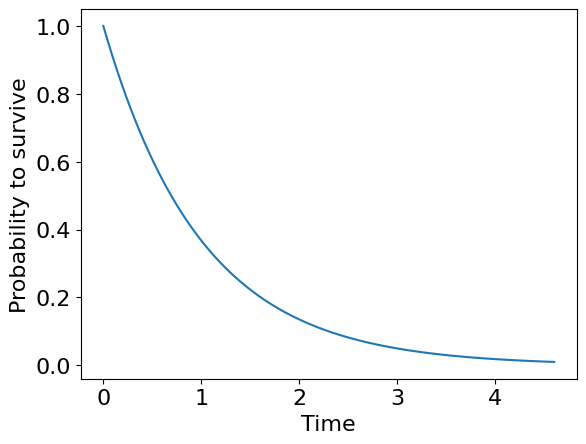
This plot is what we actually call survival curve
So, in survival analysis death density is probability density function PDF, while death probability is cumulative density function CDF
Therefore the intuition behind death curve and survival curve is rather straightforward - it shows how many of experimental objects died / survived before a partucular moment of time.
You can see a lot of empirical versions of survival curves in articles. Rigorous analysis of this curves helps to avoid a misinterpretation of typical drug-testing experiment or other. And it’s what we are going to do in further. But firstly we will talk about mortality risk
4.1.3. Mortality risk#
You could have heard that mortality risk increases exponentially with aging. But what does this actually mean?
Note
Mortality risk is not a probability of death!
Let’s consider instantaneous probability of death that the object will die within a time interval \(dt\) by condition that it already survived to moment \(T\):
This conditional probability can be decomposed by definition as follows:
This yields:
Recall that \(P(T > t) = 1 - F(t) = S(t)\) and \(P(t < T ≤ t + dt) = F(t+dt) - F(t)\).
Note
To understand the last property it is enough to remember that probability function is just a area under probability density function!
Now let’s rewrite our result:
It’s time to put our derivation to the first formula with a limit. So, we have:
Yes, we obtained a ratio of probability density function of death and probability of survival. And this is what we call mortality risk function or hazard function.
Exercise 1
Show that \(f(t) = -S'(t)\) so that we can conclude that the equation below is correct:.
This is actually the thing that increases exponentially as we age and have a name of Gompertz law (quite more complex than just a probability, isn’t it?)
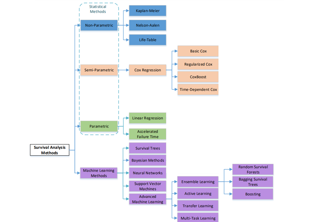
4.2. Survival analysis methods and challenges#
The survival analysis methods can be classified into two main categories: statistical methods and machine learning based methods. Both methods have the common goal to make predictions of the survival time and estimate the survival probability. However, statistical methods focus more on characterizing the distributions of the event times and the statistical properties of the parameter estimation, while machine learning methods focus more on the prediction of event occurrence.
Based on the assumptions and the usage of the parameters the traditional statistical methods can be subdivided into three categories: 1) nonparametric models, 2) parametric models and 3) semi-parametric models.
Non-parametric methods are more efficient when there is no underlying distribution for the event time (or the proportional hazard assumption is not hold). Parametric methods are more efficient when the time to event of interest follows a particular distribution specified in certain parameters. Semi-parametric models - hybrid of the parametric and non-parametric approaches - is more consistent under a broader range of conditions compared to the parametric models, and more precise than the non-parametric methods
There are several challenges in survival analysis such as censoring, high dimensionality of data and violation of assumption about linear relationship between covariates and mortality risk. Additional challenge is associated with time-varying covariates which are difficult to be accounted for in survival models.
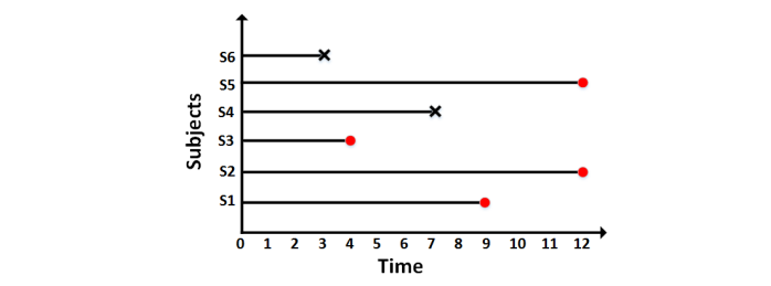
The most specific challenge is censoring - imperfect observation of time-to-event. The events of interest are abscent for some instances because of two main reasons: 1) limited time window of research, 2) missing traces. The most common is limited time window problem which leads to censoring named “right-censoring”. Despite we do not know the actual survival time for censored instance i, we still should consider it in alalysis as we can conclude that at least the instance i did not experience the event of interest before the censoring time Ci and this is valuable information we do not want to loose. All survival methods are designed to handle censoring!
The picture below illustrates censoring:
Machine learning and neural network approaches are believed to have better predictive performance in case of high data dimensionality and nonlinear covariate relationships.
4.2.1. Real data#
We will consider real data and understand how to estimate survival curves. For these purposes we use a lifelines that is a nice library survival analysis. First, let’s look at the toy dataset of miR-137 gene knock-out in fruit flies.
Note
We didn’t find any references to “waltons” dataset but there is some study showing that miR-137 gene knock-out (apparently) affects lifespan [].
from lifelines.datasets import load_waltons
import seaborn as sns
import warnings
warnings.filterwarnings('ignore') #for a clean output

df = load_waltons()
print("Data shape", df.shape, '\n')
print(df['group'].value_counts(), '\n') #group counts
print(df['E'].value_counts()) #event counts
df.head(5)
Data shape (163, 3)

control    129
miR-137     34
Name: group, dtype: int64

1    156
0      7
Name: E, dtype: int64
| T | E | group | |
|---|---|---|---|
| 0 | 6.0 | 1 | miR-137 |
| 1 | 13.0 | 1 | miR-137 |
| 2 | 13.0 | 1 | miR-137 |
| 3 | 13.0 | 1 | miR-137 |
| 4 | 19.0 | 1 | miR-137 |
We see a standard survival analysis data where columns T contains life durations or particular individuals (flies); group contains information about whether an individual was case (34 entries with knock-outed gene) or control (129 entries). The column E is event column with 1 representing the occured event and 0 representing censoring. (More information about censoring you can find here censoring)
Censoring is especially prevalent in survival analysis of human data (survivability after treatment, surgery, etc.) but in experiments with animals we can overcome some troubles with censoring by just excluding bad data entries. In our case it is not a big problem to exclude 7 of 163 samples - let’s do it and consider purified dataframe in a more human-readable format.
df = df[df.E != 0]
sns.boxplot(x='group', y='T', data=df);
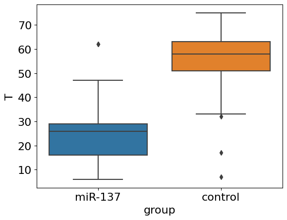
Things are getting clear! We apparently see quite strong an effect of decreasing of average lifespan in knock-outed flies. However, we do not see a dynamics: what about maximum lifespan and concaveness of survival curve? The whole picture is available only after estimation of survival curve from data.
4.3. Nonparametric methods#
4.3.1. 1. Kaplan-Meier estimator#
In real life we often do not know the true model generating our observations.Therefore it is reasonable to use non-parametric estimators which are free from model assumptions. The most frequently used is a Kaplan-Meier estimator having a nice property to be unbiased estimate of \(S(t)\) when censoring excluded:
where \(t_{i}\) a time when at least one event happened, \(d_i\) the number of deaths (events) that happened at time \(t_{i}\), and \(n_{i}\) the individuals known to have survived (have not yet had an event or been censored) up to time \(t_{i}\). Let’s learn how to use this formula step by step.
from lifelines import KaplanMeierFitter
import autograd.numpy as np

T = df['T']
km = KaplanMeierFitter(alpha=0.05) #alpha - level of significance for confidence interval estimation, see below.
km.fit(T)
km.event_table.head(7) #please, look at this nice table
| removed | observed | censored | entrance | at_risk | |
|---|---|---|---|---|---|
| event_at | |||||
| 0.0 | 0 | 0 | 0 | 156 | 156 |
| 6.0 | 1 | 1 | 0 | 0 | 156 |
| 7.0 | 1 | 1 | 0 | 0 | 155 |
| 9.0 | 3 | 3 | 0 | 0 | 154 |
| 13.0 | 3 | 3 | 0 | 0 | 151 |
| 15.0 | 2 | 2 | 0 | 0 | 148 |
| 17.0 | 1 | 1 | 0 | 0 | 146 |
Yes, we call model class and fit it, but don’t worry it is just for convenience and brevity of an explanation. The event table above contains 5 columns and time steps as indexes. You see that indexes are grouped by the same time steps in such way that several events could happen within one time step. Note, there are no time steps without events (with exception of zero time step)!
The column censored contains zeros because we excluded censored observations. This means that the column observed, containing death events, and the column removed will be the same (however, different models can treat these columns differently) and corresponding the term \(d_i\) in the formula above. Column entrance is redundant and needed just for convenience of probability computation (see below). The last column at_risk corresponds to the term \(n_i\) - the number of individuals known to have survived up to time \(t_{i}\) (we assume that all the individuals dies in the end of a time step). Some code now:
test = km.event_table
test['p'] = 1 - test['removed'] / test['at_risk'] #use formula above
test['S'] = test['p'].cumprod() #cumulative product
test.head(7)
| removed | observed | censored | entrance | at_risk | p | S | |
|---|---|---|---|---|---|---|---|
| event_at | |||||||
| 0.0 | 0 | 0 | 0 | 156 | 156 | 1.000000 | 1.000000 |
| 6.0 | 1 | 1 | 0 | 0 | 156 | 0.993590 | 0.993590 |
| 7.0 | 1 | 1 | 0 | 0 | 155 | 0.993548 | 0.987179 |
| 9.0 | 3 | 3 | 0 | 0 | 154 | 0.980519 | 0.967949 |
| 13.0 | 3 | 3 | 0 | 0 | 151 | 0.980132 | 0.948718 |
| 15.0 | 2 | 2 | 0 | 0 | 148 | 0.986486 | 0.935897 |
| 17.0 | 1 | 1 | 0 | 0 | 146 | 0.993151 | 0.929487 |
Applying the recurrent formula is easy with cumprod() method. Now we compare the S column with what package provides as a result.
ax = km.plot_survival_function(figsize=(8,5), ci_show=False) #built-in method
ax.step(test.index, test['S'], where='post', label='ours', ls='--', color='red') #from scratch
ax.legend();
ax.grid(alpha=0.3); #add
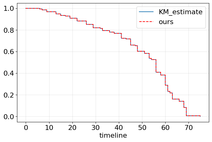
Exactly what we wanted!
One problem left. We need to split our observations by groups.
fig, ax = plt.subplots(1, 1, figsize=(8,5))
km = KaplanMeierFitter(alpha=0.05)

for name, grouped_df in df.groupby('group'):
    km.fit(grouped_df["T"], label=name)
    km.plot_survival_function(ax=ax)
ax.grid(alpha=0.3)
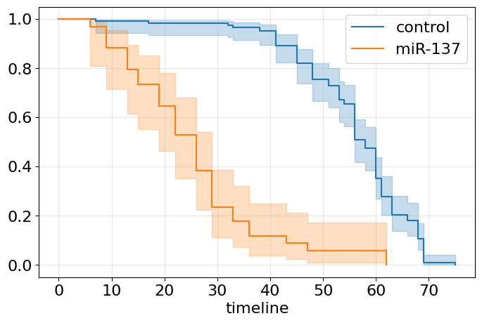
We have much to say now. Apparently, miR-137 knock-out is not just a shifting survival curve to the left (see Gompertz section) but this intervention makes the organism fragile - orange curve is similar to an exponential survival curve (constant mortality risk). In turn, blue curve demonstrates clear Gompertz pattern of normal aging, doesn’t it? At the same time, maximal lifespan seems to be not affected much, isn’t it? Both curves are shown with their 95% confidence interval (CI). It’s wider for miR-137 curve due to the higher variance. By the way, the variance of our estimate can be computed by Greenwood formula as follows:
One of the nice property of Kaplan-Meier estimate \(\widehat {S}\) is that it is asymptotically normal. We may use this property for construction a confidence interval:
where \(z_{1-\alpha/2}\) is a \(1-\alpha/2\) quantile of normal distribution.
Having two Kaplan-Meier curves it would be nice to compare them by calculating some important statistics. Mean survival time and median survival time are good candidates. Consider the expression for the first one:
Exercise 2
Prove that \(\int_0^t S(x)dx = \int_0^t xf(x)dx\) if \(t \to \infty\)
Of course we have a function for this:
from lifelines.utils import restricted_mean_survival_time

km = KaplanMeierFitter(alpha=0.05)
for name, grouped_df in df.groupby('group'):
    km.fit(grouped_df["T"], label=name)
    mu = restricted_mean_survival_time(km)
    print(name + f' {round(mu, 2) }')
control 56.08
miR-137 25.71
Exercise 3
Explore lifelines documentation, write code for median survival time computation. Compare and explain results.
Comparing means is a nice first shot to say that something is different. But in aging domain there are a lot of situations when means are very close to each other (especially when you test some new drug in mice). How to conduct more rigorous analysis? Wouldn’t it be better to compare the survival curves themselves? We will talk about it later in logrank test
4.4. Parametric methods#
Parametric methods are very efficient when the time to event of interest follows a particular distribution specified in certain parameters. We will speak about three parametric models with different defined distributions
4.4.1. 1. Exponential model (constant risk model)#
We start with the simplest case of a constant mortality function.
Exercise 4
Prove that the formula above for \(S(t)\) at constant risk is correct. Hint: use the result from the exercise 1.
Let’s draw plots for \(m\) and \(S\):
t = np.linspace(0, 20, 200)
fig, ax = plt.subplots(1, 2, figsize=(12, 5))

m0 = 0.1

ax[0].plot(t, np.ones(len(t)) * m0)
ax[0].set_xlabel('Time')
ax[0].set_ylabel('Mortality risk')

ax[1].plot(t, np.exp(-m0*t))
ax[1].set_xlabel('Time')
ax[1].set_ylabel('Probability of survival');
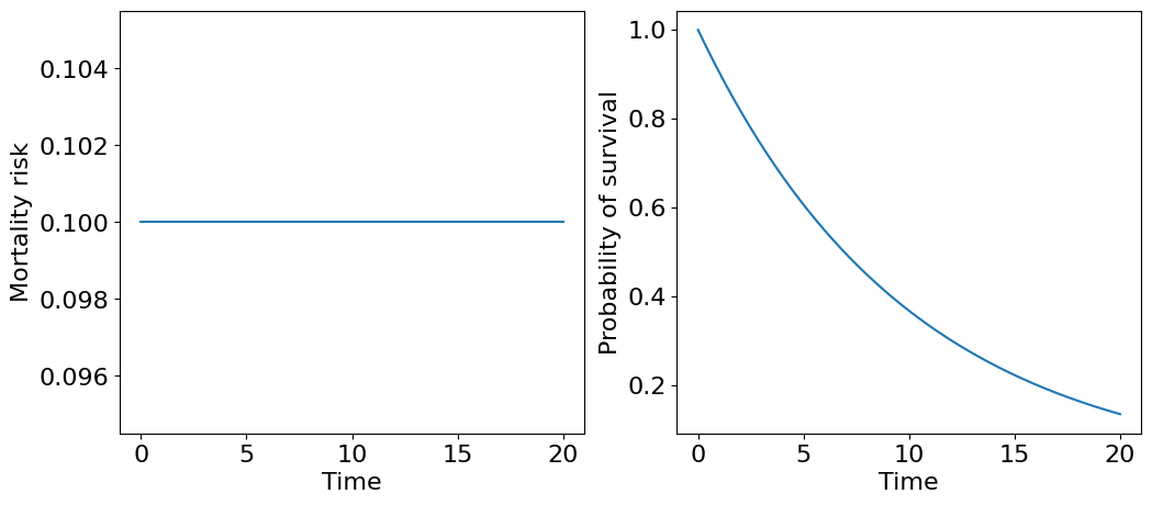
The corresponding survival curve resembles a distribution of time until radioactive particle decay or so called “law of rare events” where events independently occur with a rate \(m_0\). Intuitively, we can treat this survival curve describing survivability of an extremely fragile organism, which dies from a single failure - technically speaking, such organism is unaging! Then, \(m_0\) actually describes average number of failures per unit of time and, correspondingly, \(1/m_0\) - is a mean survival time.
Exercise 5
Prove that \(1/m_0\) - is a mean survival time using a definition of expectation.
We obtained an object, or system, with survivability depending on one critical subsystem what is not reliable. Can we do better? Sure, we can add an additional critical sustystem reserving the original. As a naive example, just imagine an organism’s life depends only of two kidney functioning. If one fails the other can work for two. This (of course) oversimplified system can be represented with the following diagram of parallel connection,
where \(m_1\) and \(m_2\) are failure risks, which we assume constant and not equal in general. How to derive a survival curve for such a system? First, let’s assume that both critical subsystems, let’s call them \(X\) and \(Y\), are independent what means that the failure of one does not affect the failure rate of the other. Then, we may consider joint probability distribution that the whole system fails:
Recall that \(F(t) = 1-S(t)\),
And now we return to survival curve:
Let’s draw it!
t = np.linspace(0, 40, 200)
m1 = 0.1
m2 = 0.2

dt = t[1] - t[0]
SX = np.exp(-m1*t)
SY = np.exp(-m2*t)
SXY = np.exp(-m1*t) + np.exp(-m2*t) - np.exp(-(m1 + m2)*t)
mXY = (m1 * np.exp(-m1*t) + m2 * np.exp(-m2*t) - (m1 + m2) * np.exp(-(m1 + m2)*t)) /\
      (np.exp(-m1*t) + np.exp(-m2*t) - np.exp(-(m1 + m2)*t))

fig, ax = plt.subplots(1, 2, figsize=(13, 5), constrained_layout=True)

ax[0].plot(t, [m1] * len(t), label=f'X only, m1={m1}')
ax[0].plot(t, [m2] * len(t), label=f'Y only, m2={m2}')
ax[0].plot(t, mXY, label='X or Y')
ax[0].legend()
ax[0].set_xlabel('Time')
ax[0].set_ylabel('Mortality risk');

ax[1].plot(t, SX, label=f'X only, m1={m1}')
ax[1].plot(t, SY, label=f'Y only, m2={m2}')
ax[1].plot(t, SXY, label='X or Y')
ax[1].legend()
ax[1].set_xlabel('Time')
ax[1].set_ylabel('Probability of survival');
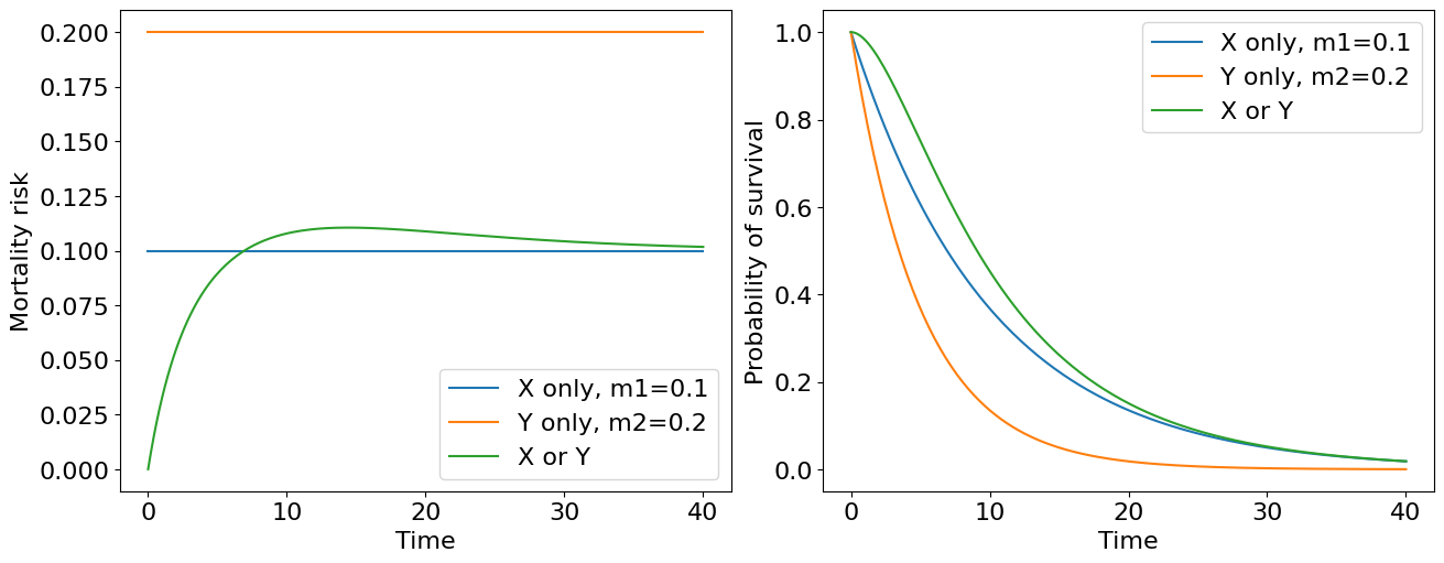
We see the lower value of mortality risk the higher survival curve lies if we consider our kidneys (critical subsystems) separately. Combining them into one system leads to the highest survival curve (green curve on the plot). Thus we see a quite obvious corollary: the higher number of reserved subsystems object have the more survival it becomes… But wait a second! What’s wrong with the mortality curve for two kindeys system? It is not constant now. We started with two kidneys each having its own constant failure risk and ended with a system where mortality risk is now a function of time - aging system actually! It is quite reasonable if we treat aging as a process of critical subsystem failures culminating with system “death”.
In fact, you may consider human organism as a just a combination of parallel and sequential connections of such critical subsystems (organs) - not bad model for a start (see, for example [Gavrilov and Gavrilova, 2005]). To calculate a survival curve of a particular complex model, you may just use the following formulas considering your system as a set of sequential and parallel block connections.
Exercise 6
Compute an expression for mortality risk of sequential subsystems connection.
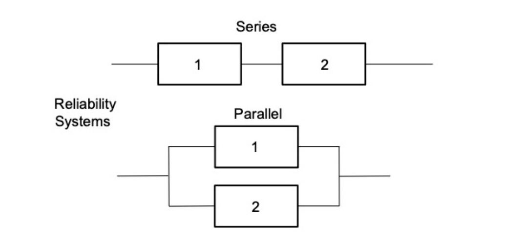
Reliability \( R \)
Failure probability \( F \) $\( R = 1 - F \)$
For series: $\( R_{12} = R_1*R_2 \)$
For parallel: $\( R_{12} = 1 - (1-R_1)(1-R_2) \)$
4.4.2. 2. Weibull model#
Let’s proceed with our example of aging system consisted from “unaging” or fragile elements. Now let’s assume that we have \(n\) independent subsystems having the same constant mortality rate \(m\) and connected in parrallel within a system \(Z\). Using the formula above we have:
Now let’s derive a mortality risk:
And draw it:
t = np.linspace(0, 100, 200)
m = 0.1
n1 = 2
n2 = 10
n3 = 1000

SZ = lambda n: 1 - (1 - np.exp(-m * t))**n
mZ = lambda n: (n * m * np.exp(-m * t) * (1 - np.exp(-m * t))**(n-1)) / (1 - (1 - np.exp(-m * t))**n)

fig, ax = plt.subplots(1, 2, figsize=(13, 5), constrained_layout=True)

ax[0].plot(t, [m] * len(t), label=f'm={m}', ls='--', color='grey')
ax[0].plot(t, mZ(n1), label=f'n={n1}')
ax[0].plot(t, mZ(n2), label=f'n={n2}')
ax[0].plot(t, mZ(n3), label=f'n={n3}')
ax[0].legend()
ax[0].set_xlabel('Time')
ax[0].set_ylabel('Mortality risk');

ax[1].plot(t, SZ(n1), label=f'n={n1}')
ax[1].plot(t, SZ(n2), label=f'n={n2}')
ax[1].plot(t, SZ(n3), label=f'n={n3}')
ax[1].legend()
ax[1].set_xlabel('Time')
ax[1].set_ylabel('Probability of survival');
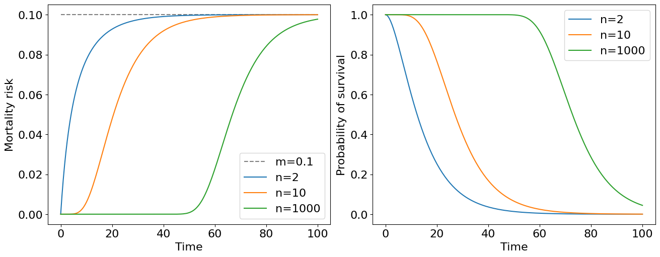
The immediate conclusion follows from this plot: the mortality risk of the system at later stages of life doesn’t depend on the number of reserve elements in the system and only on failure rates of particular elements. Having a large number of reserve element a survivability of an object can be high for quite long time.
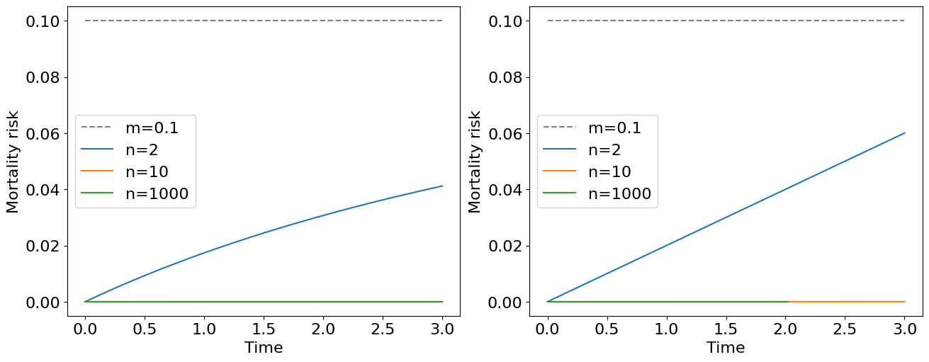
You may note that an expression for mortality risk is quite cumbersome for general \(n\) elements case. At the same time we see that all the mortality curves on the plot above approaches to the constant mortality risk \(m\) as \(t \to \infty\). It turns out that at early stages of the life, more precisely when \(t \ll 1/m\), we obtain a nice approximation of the original formula, namely:
this is exactly a Weibull risk model with a scale parameter \(a=m^n\) linked with the pace of aging. The corresponding survival and probability density functions will be:
The latter expression is a Weibull distribution density function known for its high flexibility for modelling a lot of biological and technical phenomena. It is not a good strategy to have an infinite number of low-reliable critical elements in our system, instead, it is better to have highly-reliable elements (with low mortality risk) confering us a great lifespan.
t = np.linspace(0, 3, 200)
m = 0.1
n1 = 2
n2 = 10
n3 = 1000

mZ1 = lambda n: ((n) * ((m)**n) * ((t)**(n-1)))
mZ = lambda n: (n * m * np.exp(-m * t) * (1 - np.exp(-m * t))**(n-1)) / (1 - (1 - np.exp(-m * t))**n)

fig, ax = plt.subplots(1, 2, figsize=(13, 5), constrained_layout=True)

ax[0].plot(t, [m] * len(t), label=f'm={m}', ls='--', color='grey')
ax[0].plot(t, mZ(n1), label=f'n={n1}')
ax[0].plot(t, mZ(n2), label=f'n={n2}')
ax[0].plot(t, mZ(n3), label=f'n={n3}')
ax[0].legend()
ax[0].set_xlabel('Time')
ax[0].set_ylabel('Mortality risk');

ax[1].plot(t, [m] * len(t), label=f'm={m}', ls='--', color='grey')
ax[1].plot(t, mZ1(n1), label=f'n={n1}')
ax[1].plot(t, mZ1(n2), label=f'n={n2}')
ax[1].plot(t, mZ1(n3), label=f'n={n3}')
ax[1].legend()
ax[1].set_xlabel('Time')
ax[1].set_ylabel('Mortality risk');
4.4.3. 3. Gompertz model#
Weibull model provides a nice explanation of aging phenomena in terms of elements reliability. Unfortunately, the reality is harder. It turns out that weibull risk model has “too slow” speed of growth. The actual observable mortality of different species obeys exponential law. This is the place where Benjamin Gompertz appears. He found that the force of mortality increases in geometrical progression with the age of adult humans. According to the Gompertz law, human mortality risk doubles about every 8 years of adult age []. Moreover, an exponential mortality behaviour is observed for many biological species, including fruit flies, nematodes, flour beetles, mice, dogs, and baboons [Gavrilov and Gavrilova, 2005]. Mathematically, it can be formulated as follows:
where \(A\) - Initial Mortality Rate (IMR), this parameter characterizes the initial mortality, that is, the mortality that would be in the population without aging, and does not depend on age; \(b\) - characterizes the rate of aging. To clarify the previous observation about Mortality Rate Doubling Time (MRDT) is 8 years, we can use the following simple quotient:
from where we get the value of \(b = \ln{2} / MRDT = 0.087\) for humans. Those who did the exercises could note that the survival function can be elegantly written as:
Putting Gompertz risk to the intergral yields the following expression for the survival curve:
Exercise 7
Derive the formula for the Gompertz survival curve from scratch.
It’s time to draw!
t = np.linspace(0, 100, 200)
A1, b1 = (0.005, 0.087)
A2, b2 = (0.0005, 0.087)
A3, b3 = (0.005, 0.0087)
A4, b4 = (0.0005, 0.174)

SZ = lambda A, b: np.exp(-A / b * (np.exp(b * t) - 1))
mZ = lambda A, b: A * np.exp(b * t)

fig, ax = plt.subplots(1, 2, figsize=(13, 5), constrained_layout=True)

ax[0].semilogy(t, mZ(A1, b1), label=f'A={A1}, b={b1}')
ax[0].semilogy(t, mZ(A2, b2), label=f'A={A2}, b={b2}')
ax[0].semilogy(t, mZ(A3, b3), label=f'A={A3}, b={b3}')
ax[0].semilogy(t, mZ(A4, b4), label=f'A={A4}, b={b4}')
ax[0].legend()
ax[0].set_xlabel('Time, years')
ax[0].set_ylabel('Mortality risk, log');

ax[1].plot(t, SZ(A1, b1), label=f'A={A1}, b={b1}')
ax[1].plot(t, SZ(A2, b2), label=f'A={A2}, b={b2}')
ax[1].plot(t, SZ(A3, b3), label=f'A={A3}, b={b3}')
ax[1].plot(t, SZ(A4, b4), label=f'A={A4}, b={b4}')
ax[1].legend()
ax[1].set_xlabel('Time, years')
ax[1].set_ylabel('Probability of survival');
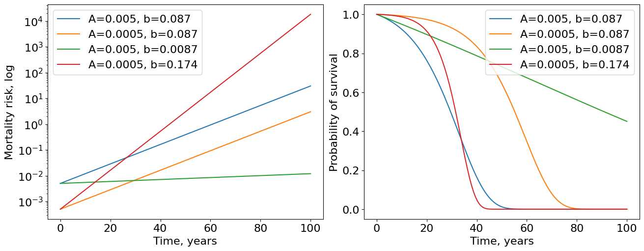
We used basic parameters \(A=0.005\) and \(b=0.087\) for human mortality risk according to [] (see Fig.3). Such parameters yield blue curves of survival and mortality. Since we have more or less realistic parameters inferred from real data, now time have units of years. Now we introduce three modifications of Gompertz parameters. First, we decrease IMR (\(A\)) by 10 times holding \(b\) the same. The result is the orange curve demonstrating moving to right from the initial curve. This increases the maximum human lifespan of the population. Second, we decrease rate of aging (\(b\)) by 10 times preserving IMR the same and the result is a much greater (green curves) increase in maximum lifespan by comparing with modification of IMR. This hints us that it is more promising strategy to improve the rate of aging than IMR. Moreover, if we improve IMR by 10 times but deteriorate rate of aging by only 2 times (red curve) we obtain the population that ages very quickly after some time - exactly what we see in countries with advanced medicine.
4.4.4. Fittting Gompertz model#
This is an additional subsection developing an intuition about fitting custom parametric estimators by power of lifelines. We spend a lot of time discussing Gompertz risk model, so it would be inexcusably not to fit Gompertz model on our pretty flies data. Do it!
from lifelines.fitters import ParametricUnivariateFitter

df0 = df[df['group']=='control']
T0 = df['T']
Tmax = T0.max() #normalization constant needed for optimizer convergence

#Below we create custom class with Gompertz model parametrized as it was discussed above.
#This model inherits all important methods and atributes of parent class ParametricUnivariateFitter which is also using
#for fitting other simple models like exponential one (constant risk).
class GompertzFitter(ParametricUnivariateFitter):
    # parametrization as above
    _fitted_parameter_names = ['A_', 'b_']

    def _cumulative_hazard(self, params, times): #cumulative hazard is just an integral of risk function
        A_, b_ = params
        return A_ * (np.expm1(times * b_ / Tmax)) #expm1 = exp(...) - 1

ggf = GompertzFitter(alpha=0.05) #fit Gompertz model
ggf.fit(T0)
ggf.print_summary()

ax = ggf.plot_survival_function(figsize=(8,5))
ax = KaplanMeierFitter().fit(T0).plot(ax=ax, ci_show=False) #and compare with KM
ax.set_title(f'True $b$ coefficient: {round(ggf.b_/Tmax, 3)}'); #rescale coefficient
| model | lifelines.GompertzFitter |
|---|---|
| number of observations | 156 |
| number of events observed | 156 |
| log-likelihood | -641.37 |
| hypothesis | A_ != 1, b_ != 1 |
| coef | se(coef) | coef lower 95% | coef upper 95% | cmp to | z | p | -log2(p) | |
|---|---|---|---|---|---|---|---|---|
| A_ | 0.01 | 0.00 | 0.00 | 0.02 | 1.00 | -231.87 | <0.005 | inf |
| b_ | 5.90 | 0.44 | 5.05 | 6.76 | 1.00 | 11.26 | <0.005 | 95.28 |
| AIC | 1286.75 |
|---|
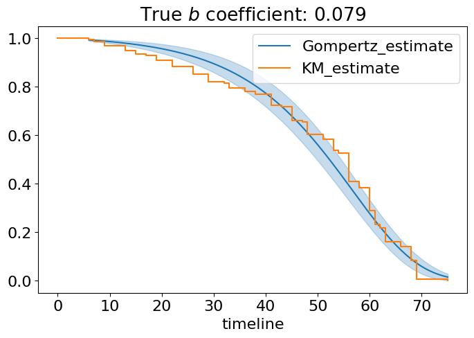
Yeah, it is really a good fit. We used only data from naturally aging flies and obtained nice estimation of Gompertz rate of aging \(b=0.08\) (please, ignore the coefficient in the table - it should be rescaled due to the presense of normalization constant Tmax) and \(A=0.01\) which are quite close to what we have seen for humans. The summary table has many interesting things like Akaike information criterion (AIC) useful for comparison of different models, log-likelihood and important statistics about coefficients. For now, we can definitely say, Gompertz model is a good model of aging flies!
4.5. Comparison of survival curves#
4.5.1. 1. Logrank test#
Okay, we need to compare two survival curves. Logrank is probably the most popular nonparametric test doing that. Let’s designate \(S_0(t)\) and \(S_1(t)\) as control and case survival curves (control and mir-137 in our case). The logrank test is used to test the null hypothesis that there is no difference between the populations in the probability of an event (here a death) at any time point. Formulate null hypothesis:
\(H_0\): \(S_0(t) = S_1(t)\)
\(H_A\): \(S_0(t) \neq S_1(t)\)
The logrank analysis is based on the times of events. For each such time we calculate the observed number of deaths in each group and the number expected if there were in reality no difference between the groups.
To conduct logrank we need to construct contingency table for each time step at which an event happened and compute chi-squared statistics. Once statistics computed it’s easy to calculate p-value and address to null hypothesis. Do it in a few steps:
Compute the contingency table for each time step with event in at least one group as follows:

Prepare all important terms for summation:
\(O_i = d_{1i}\) - observed number of deaths;
Under hypothesis \(H_0\) for each group O follows a hypergeometric distribution with expected value and varience computed by the formulas below:
\(E_i = d_{i}\frac{n_{1i}}{n_i}\) - expected number of deaths;
\(V_i = \frac{n_{1i}n_{0i}d_i(n_{i}-d_i)}{n_{i}^2(n_{i}-1)}\) - variance of the observed number of deaths;
Compute logrank test statistics:
This can be quite cumbersome for calculating from scratch, happily, everything already done for us in lifelines.
from lifelines.statistics import logrank_test

#split our groups
df1 = df[df['group']!='control']
df0 = df[df['group']=='control']
T1, G1 = df1['T'], df1['group']
T0, G0 = df0['T'], df0['group']
# and apply test directly to durations
results = logrank_test(T1, T0)
results.print_summary()
| t_0 | -1 |
|---|---|
| null_distribution | chi squared |
| degrees_of_freedom | 1 |
| test_name | logrank_test |
| test_statistic | p | -log2(p) | |
|---|---|---|---|
| 0 | 114.43 | <0.005 | 86.30 |
Interpretation of longrank test: if the calculated p-value is greater than 0.05, the null hypothesis is not rejected. The logrank test is purely a test of significance it cannot provide an estimate of the size of the difference between the groups or a confidence interval.
The result is here and we can surely reject null hypothesis about equality of survival curves at the 0.005 level of significance. It worth to repeat that using statistical tests is really important in survival analysis, especially in aging domain where you can see as tiny results can be presented as a big advance in science, frequently without rigorous statistical comparison of case-control curves.
There are some important facts you should know about logrank test:
logrank test has maximum power when hazard functions are proportional, with coefficient \(k>1\): \(h_1(t) = kh_2(t)\);
logrank test is sensitive to differences in tails of distributions;
logrank test has low power if two curves intersect.
https://www.ncbi.nlm.nih.gov/pmc/articles/PMC403858/
Exercise 8
Choose and download two mice survival datasets from ALEC by applying different strain/sex/intervention filters. Complete the following tasks:
Estimate datasets with Kaplan-Meier and Weibull estimators;
Plot their survival plots (in one axes);
Plot hazard plots for Weibull. If you also want to plot hazard for nonparametric method you can do it for NelsonAalenFitter using lifelines
Compare datasets with Logrank test;
Answer the question: is the Logrank appropriate for your choice of datasets? Explain why?
Explore lifelines documentation, write code for median survival time calculation for your datasets. Compare and explain results.
4.6. Conclusion#
Mortality curves can have different shapes (increasing, decreasing, u-shape, const) which say us a lot about aging of a particular organism.
Constant mortality function models “non-aging” organism which has only one critical subsystem and therefore is fragile.
Combination of a big number of fragile subsystems leads us to a Weibull mortality risk. It is already a good approximation of what really happens in reality but we can do better with…
Gompertz risk model which has a nice approximation power or real data. Its parameters are well interpretable as initial mortality risk and rate of aging. Not all species obey Gompertz model but, as always, more complexity means less interpretability.
Real data requires proper estimators of survival curves. One great non-parametric way is to use Kaplan-Meier approach.
Logrank and other statistical tests are important to check difference between two survival curves, and, therefore, if the experiment really significant for aging science.
Remember, everything here are models, wrong but useful!
Nice cheatsheet for transformation rules here:

4.7. Learn more#
There is a lot more that you can do with outputs (such as including interactive outputs) with your book. For more information about this, see the Jupyter Book documentation
4.8. Credits#
This notebook was prepared by Dmitrii Kriukov and edited by Margarita Sidorova
4.9. Acknowledgements#
We thank Alexander Fedintsev, who made a significant contribution to the theoretical part of this notebook.